
LSTM Visualization: Tools & Techniques for 2025
Introduction to LSTM Visualization
Understanding how an LSTM processes information can be challenging—but it makes it visually intuitive. In this guide, we’ll explore how to visualize hidden state dynamics, attention weights, gate activations, loss curves, and performance metrics using Python, Keras, and TensorFlow. Whether you’re building interpretable models or diagnosing training issues, these visualization tools help you see what an LSTM “thinks.”
1. Visualizing Gate Activations (Input, Forget, Output Gates)
Each LSTM step computes gate activations that control memory flow. To visualize these:
- Extract gate outputs per timestep using custom Keras callbacks or intermediate models.
- Plot input vs forget gate activations over sequence length using Matplotlib or Seaborn.
This lstm visualization gates method helps you detect saturation (gates stuck at extremes) and diagnose vanishing or exploding gradient issues.
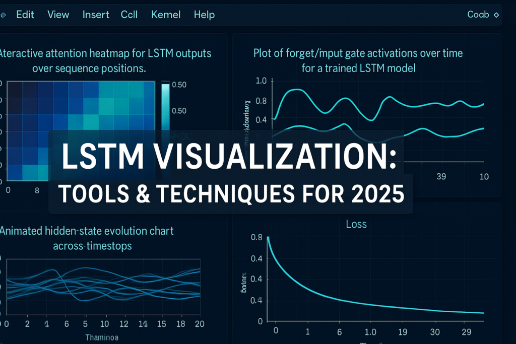
2. Hidden State Evolution Over Time
Visualizing how hidden state vectors hth_tht evolve gives insight into memory retention:
- Use dimensionality reduction techniques like PCA or t-SNE to project hidden states.
- Animate or plot trajectories across timesteps to show context shifts.
This approach is central to hidden states and helps understand how internal representations change with input sequence.
3. Attention Mechanism Heatmaps
For LSTMs augmented with attention layers:
- Extract attention weight matrices (αij)(\alpha_{ij})(αij).
- Plot heatmaps where each row represents output time steps, columns input time steps.
lstm visualization attention visualizes how much weight the model places on specific past inputs—critical in sequence-to-sequence tasks.
3.1 Visualizing Prediction Confidence Over Time
Alongside attention weights, it’s helpful to visualize how confident the model is in its predictions. You can track the softmax output probabilities or regression variance (for time-series) and plot them over time:
confidences = model.predict_proba(X_test)  # for classification
plt.plot(confidences.max(axis=1))
plt.title('Prediction Confidence Over Time')
High variability in confidence may indicate inconsistent generalization, especially in inputs with ambiguous structure. Add overlays to identify spikes corresponding to mispredictions—valuable for debugging with lstm visualization performance insights.
4. Training Dynamics: Loss & Gradient Flow Visualization
Monitoring training helps improve performance and avoid pitfalls:
- Plot training and validation loss curves across epochs: essential lstm visualization training.
- Visualize gradient norms or gate activation variances to catch early signs of divergence or stagnation.
These visualizations form part of typical lstm visualization performance workflows.
5. Visualization Tools: Python, Keras, TensorFlow & External Libraries
Popular tools include:
- TensorBoard: built-in support for loss curves, histograms, embedding projections, and custom scalars.
- Matplotlib/Seaborn: for custom attention heatmaps and gate plots.
- Plotly or Bokeh: create interactive dashboards to explore hidden states dynamically.
- Weights & Biases (WandB): logs model metrics and supports custom visualizations.
Using these tools ensures robust lstm visualization tools support in your workflow.
6. Example Code Snippet for Gate and Hidden-State Visualization
from tensorflow.keras.models import Model

layer = model.get_layer('lstm_layer')
intermediate_model = Model(inputs=model.input, outputs=[layer.output, layer.states[0], layer.states[1]])
h_seq, c_seq, h_last = intermediate_model.predict(padded_input)

# Plot forget gate activations
# Plot hidden state PCA over sequence
This exemplifies lstm visualization python workflow using keras or tensorflow pipelines.
7. Interpretability & Error Analysis via Visualization
Visual interpretable analytics help trust models:
- Overlay gate activation anomalies with prediction errors to understand failure points.
- Use heatmaps to highlight attention failure cases.
- Track hidden state drift during error-prone inputs for deeper debugging.
This ties into lstm visualization error analysis and interpretability best practices.
7.1 Layer-Wise Visualization for Deep LSTM Models
For stacked LSTMs, it’s insightful to visualize each layer’s hidden state separately. Higher layers capture abstract patterns, while lower ones track raw sequences.
intermediate_model = Model(inputs=model.input, outputs=[
  model.get_layer('lstm_1').output,
  model.get_layer('lstm_2').output
])
outputs_1, outputs_2 = intermediate_model.predict(inputs)
Then, plot differences in dynamics, e.g., layer 1 reacts to token shifts, while layer 2 focuses on structure. This helps in model interpretability and fine-tuning multi-layer LSTM architectures.
8. Real-Time Monitoring & Interactive Dashboards
For production or long training jobs:
- Stream metrics to interactive dashboards using TensorBoard.dev, WandB, or a custom Flask dashboard.
- Monitor gate saturation or hidden-state collapse during training in real-time.
- Enable checkpoints tied to visualization anomalies for proactive model evaluation.
Useful in lstm visualization real-time monitoring scenarios.
Links & Further Resources
- Attention visualization tutorial: tensorflow.org seq2seq nmt_attention
- TensorBoard guide for RNNs: tensorflow.org tensorboard/rnn_logs
- Interactive visualization library: plotly.com
- Research on interpretability of RNNs: arXiv Architecture Visualization Studies
✅ Frequently Asked Questions (FAQs)
- What’s the easiest way to visualize LSTM gates?
Use Keras functional API or custom callbacks to extract gate outputs, then plot with Matplotlib or Seaborn. - Can I visualize attention if my LSTM doesn’t use attention?
No—attention heatmaps require an attention layer. Without attention, focus on gates and hidden states. - Is interactive LSTM visualization necessary?
It’s helpful for deep debugging or interpretability-focused projects, but static plots often suffice. - Can TensorBoard show hidden states?
Yes—using custom metrics or embedding projections logged during training. - Where to find open-source dashboards or projects?
Explore GitHub with search terms like “lstm visualization keras”, “lstm attention heatmap notebook”, or demos using Plotly dashboards.
Discover more from Neural Brain Works - The Tech blog
Subscribe to get the latest posts sent to your email.